Introduction
Credit Suite asked me to evaluate an app design for Fundability. One aspect of Fundability is a FICO score to predict how successful a business is in being approved for corporate financing based on Credit Suite calculations.
My Role
• UX/UI Design
• Research
• Concept Development
• Problem Solving
Tools
• Adobe Illustrator
• PowerPoint
• XD
Challenge
With a time limit, I decided to focus the analysis on the Home page instead of reviewing the entire app. I did go through all the features of the app. One key aspect of the Fundability app is the number score. Like the FICO score, it is a made-up number based on weighted criteria.
Customers often are confused about how a FICO score is calculated and lack knowledge on how to improve that score. This added to the confusion, and the personal scores have different numbers than those for businesses. I concluded it was essential to show how the Fundability score is calculated.
Approach
I created several concepts to represent improvements to the Fundability App. My observations, likes, dislikes, and suggestions for making UI/UX improvements were all incorporated into a presentation I gave online to the Marketing and Development Leads, as everyone works remotely.
• First, what is Fundability? The online search did not yield any solid definition. Fundability is a Credit Suite-created score like a FICO.
• Looked up how FICO, Experian, etc. scores were calculated. Some have a high score of 850; some use 100. Why?
• Analysis of the app. Comments are below.
• Used Illustrator and XD to create concepts.
App Analysis
-
Improvements
• Relation between Rankings & Overall Score
• Simplify visually Overall Score Ranking makeup
• Add the last score feature relative to the new Overall Score
• Design call-to-action buttons at the bottom to be more visible
• Added footer icons navigation feature for easier access
• Visual Hierarchy - emphasis on what is important
• Score starting point and highest score
• Trending score either up or down
Likes
=• Location of Overall Score
- Visual hierarchy
• Ranking selection animation and larger size
- Visual emphasis
• Editing Pages
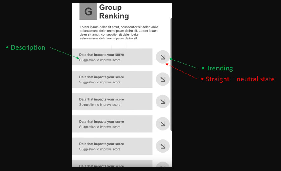
– Explanation of what each data point
• Using animation (in general)
- Visual interest
• Color indicators
- Show what is important
Dislike comments are in red.
Fundability Home Page
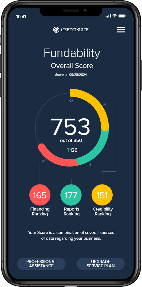
• Entertaining animation of the segmented rings -overwhelms the important Fundability score

D - Credibility Ranking
• Lack of Breadcrumb
• A few segments are clickable - too small
• 82 number is the score for Fundability, not D - confusing

Group Ranking
• Clicking on "edit" from the D page brings up this page.
UI/UX Concepts
.
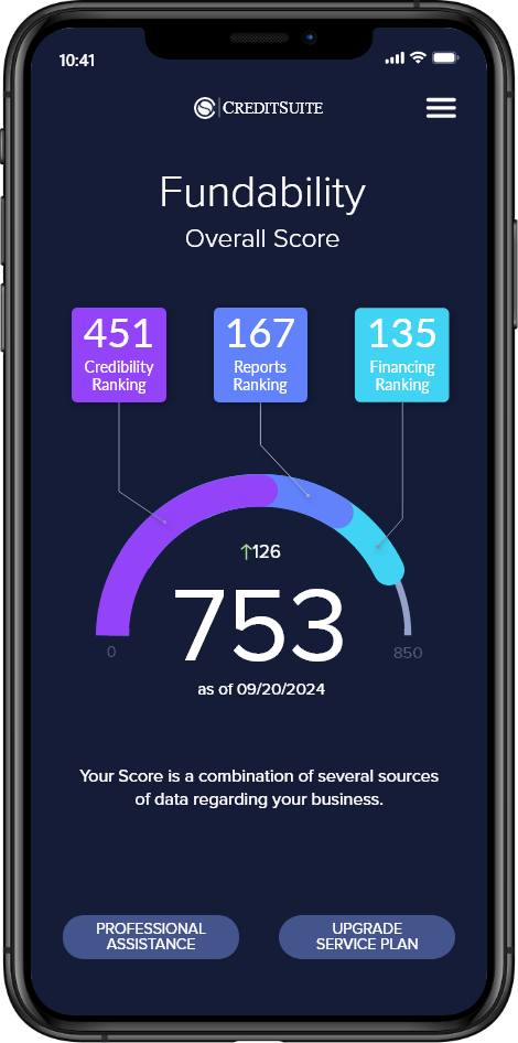
Circle Concept
• Tie ends - circle
• Score out of 850 (Fundability perfect score)
• Ranking the numbers' contribution to the Fundability Score
• Show trending with score change
• Color coordinated to each component scores
• Trending
Ring Concept
• Separate rings to show individual ranking scores.
• Color-coded with titles

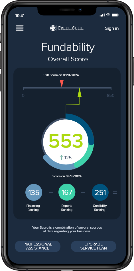
Arch Concept
• Arch design - more accessible to see the beginning and end
• Visual indicator of Ranking contribution
• Low and high scores
• Score date
Vertical Slider
• Visual indicator, low or high
• See Scale slide and impact of new score

Slider Concept
• See old score
• See the new score two ways – number & graphically on a slide
• Location and graphics support the relationship of Ranking to Score
Results
These new concepts validated some previous assumptions and opened their eyes to new UI/UX ways to communicate the idea of Fundability. They could see how difficult it was to tap one of the small ray segments around the Fundabillity Total score. In addition to how disconnected the three letter grade components make up the Fundability score in the original design versus having a number score that is part of a cumulative total score.
The Arch design was one of the UI/UX concepts that resonated with them regarding having an easy-to-follow UI visual status. It was clear what each component number was as part of the total Fundability score. The arch design graphically showed how close or far they improved or decreased.
The Slider concept was like because of the animation possibilities that could be incorporated into the app. The side-by-side call-to-action buttons were preferred vs. stacked.
Overall, they were impressed and pleased to see other possibilities, as Fundability is a new concept.